For over eight years, Quadrangle has delivered accessible built environments under the stewardship of Principal Emeritus Susan Ruptash and through AccessAbility Advantage, a joint venture with March of Dimes Canada.
Finding Our Focus
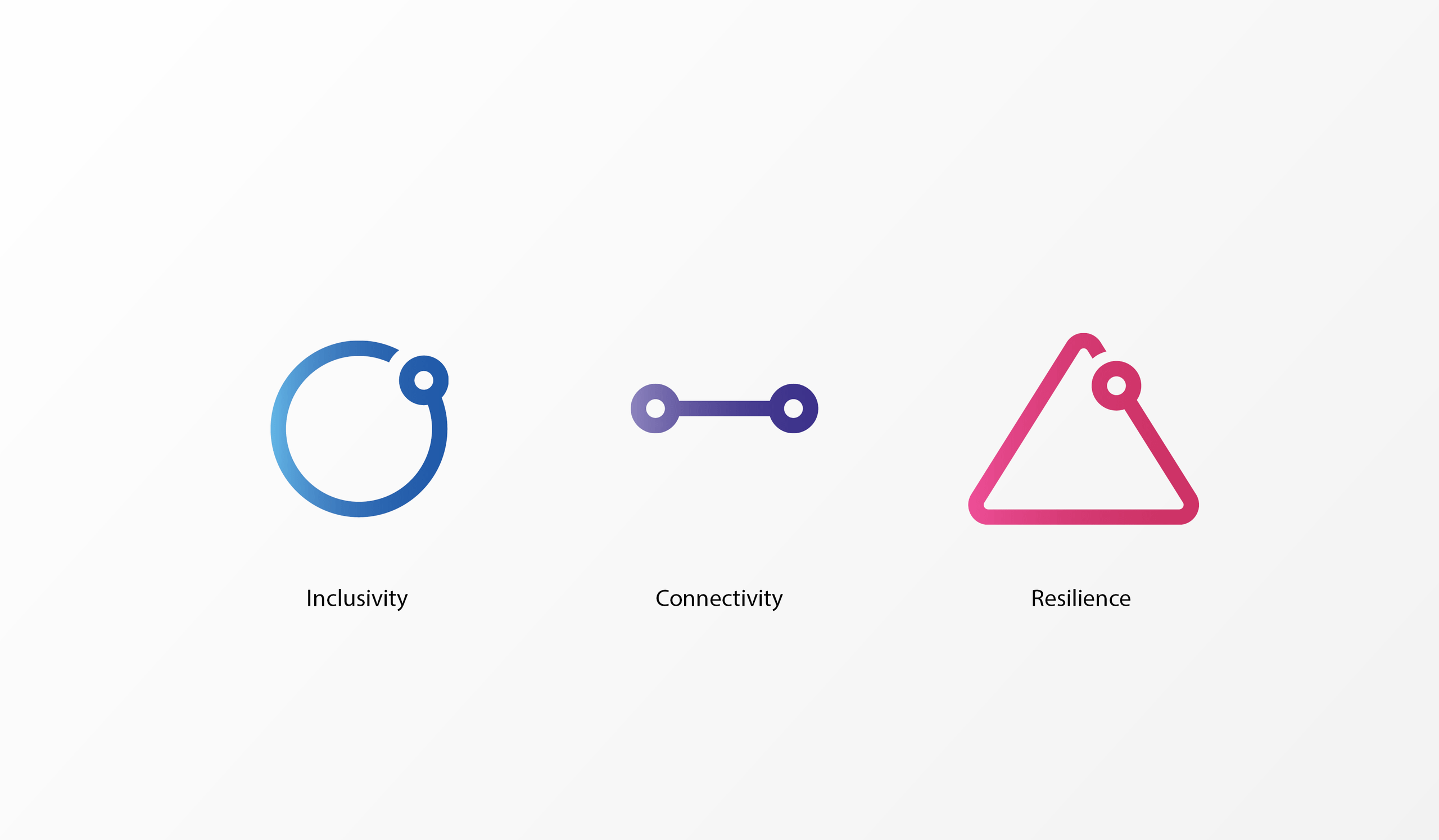
Susan’s retirement and the conclusion of our joint venture with March of Dimes Canada this year gave us the unique opportunity to reinvent our brand and expand our mandate. Our team came together in a series of charettes to talk about what it was that originally drew us to our accessibility focused practiced. Ultimately, we knew accessibility would remain a clear mandate, but we came to realise our drive stemmed from a desire to meet and exceed basic human needs. We wanted to make spaces that were for all people, transcending ability, age or lived experience, creating the potential for unity and connection through place-making. We honed in on the concept of human centred design, with a focus on environments that promote inclusion, well-being and community.
It became clear that these principles frequently overlap. How do you avoid undermining one facet of the human experience while promoting another important aspect? For example, a feature stair promotes exercise and can be a great wellness addition, but it should never be prioritized at the cost of elevator access. We found that the nuance in these conversations was something our practice was equipped to tackle. The pre-existing expertise of our accessibility team combined with the knowledge of Quadrangle’s experts in the fields of interior design and sustainability gives us a unique edge in reconciling such seemingly disparate elements.
What’s in a Name?
Our core team for this new venture put forth more than 50 different name options during workshops before distilling them down to a shortlist.
Ultimately, Human Space worked because of its simplicity. At its heart, this is a practice focused on ensuring that spaces are truly built for people.
Building the Brand
A strong visual identity was necessary to convey the mission and values of our new practice. We identified three key identities that we wanted our brand to embody, and collected precedents from each. The dynamic option looked at elements with strong contrast, defined fields of colour and heavily-weighted sans-serif fonts. The humble option conveyed our readiness to help the communities who we serve with simple iconography, rounded shapes and minimalist icons. Finally, the playful option with bright colour combinations and quirky geometries defied preconceptions that accessibility, sustainability and wellness should be clinical or institutional.
Refine, refine...define!
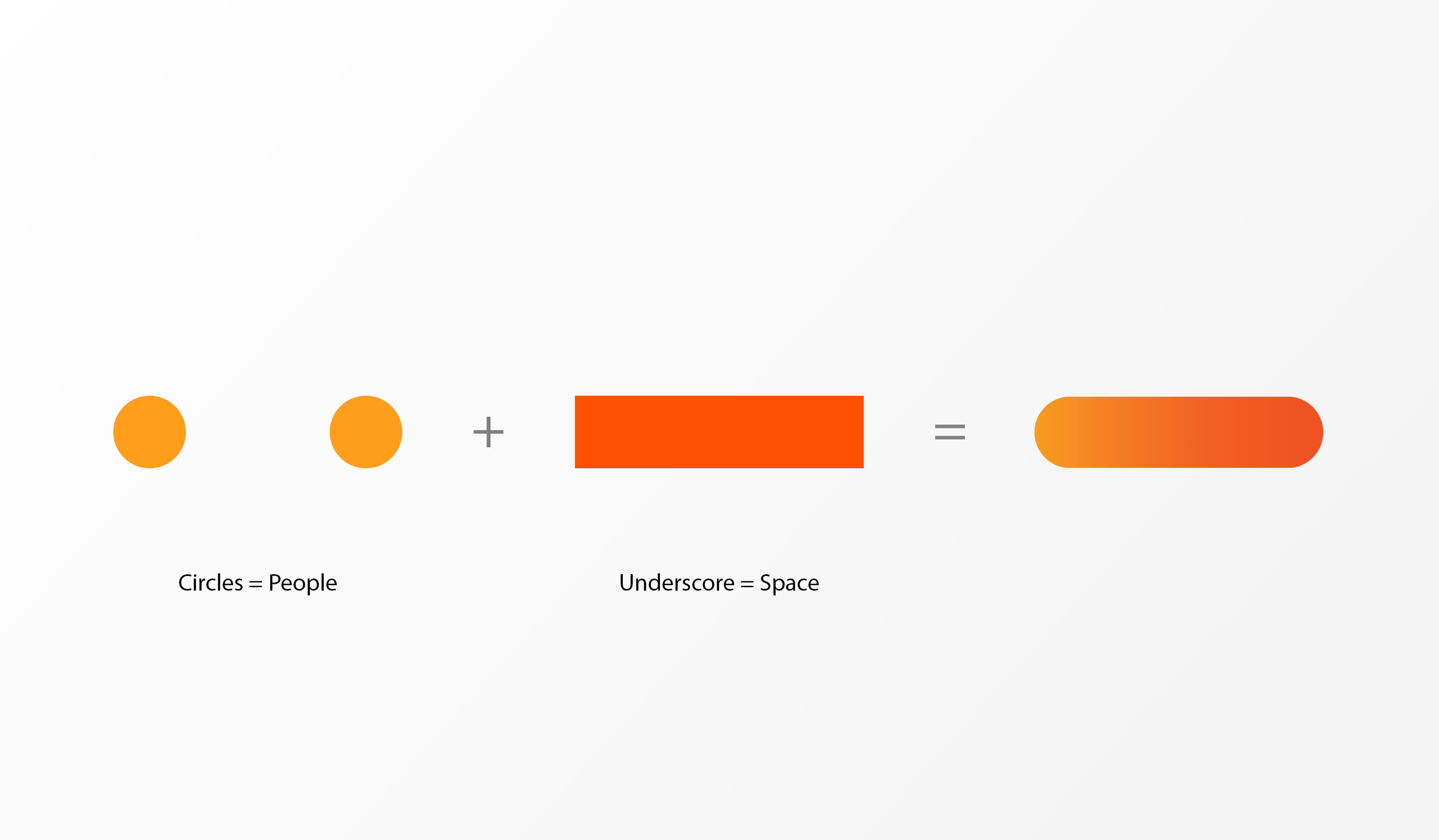
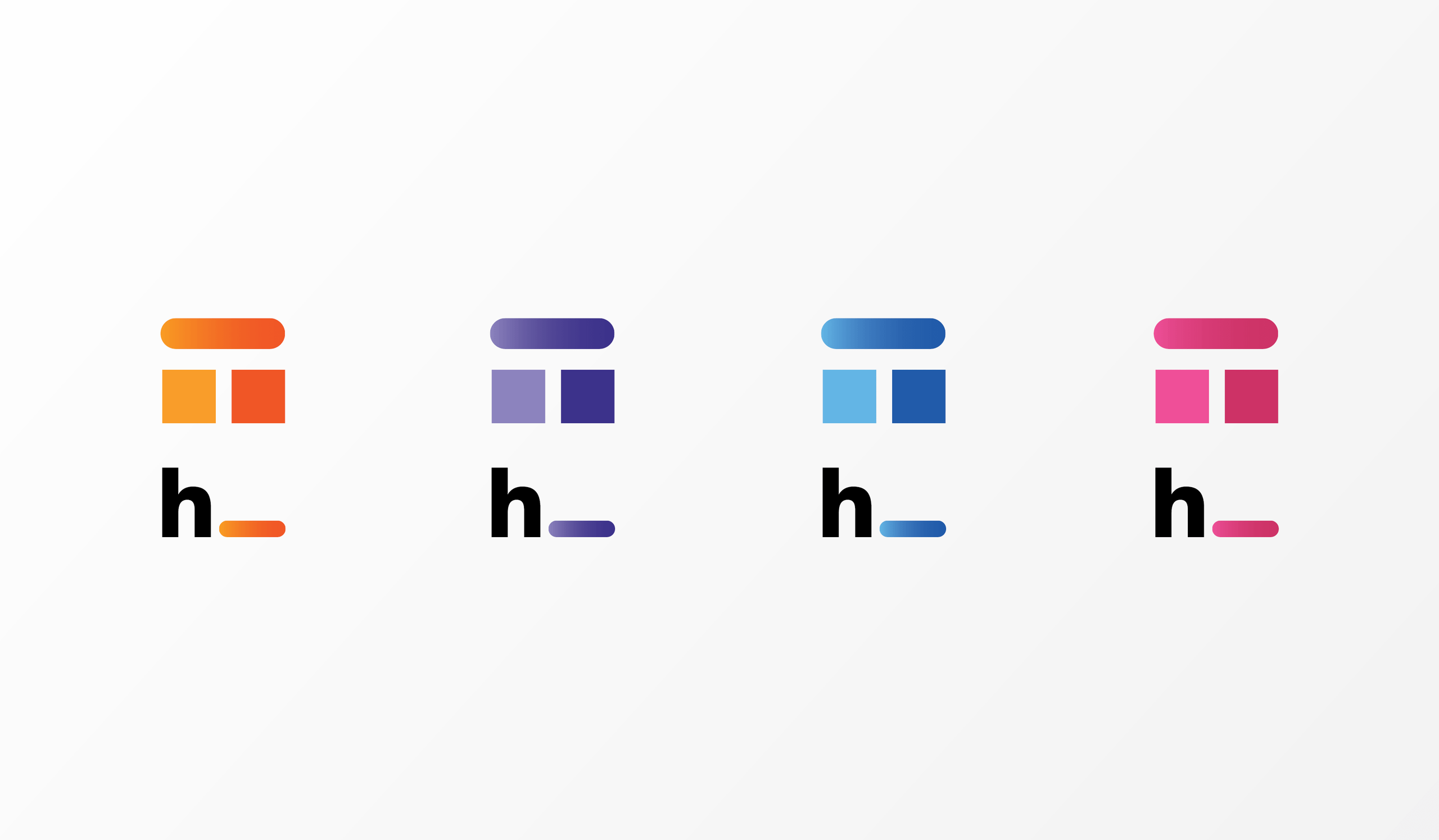
The logo that emerged as the clear embodiment of what we wanted to convey has two dots united by a field of colour, with the void between the dots representing a literal space. Each dot represents connection - the connection between the design team and client, or an environment and its users. Orange was chosen to express the energy and kinesthetic nature of the brand.
The final wordmark is a visual representation of the collaboration and problem solving we intend to bring to every project.
Rolling out the brand
A recurring design motif, the “capsule” in the logo can become a rounded, playful form to serve as a backdrop for titles, pull quotes, and other bold expressions of our mandate.
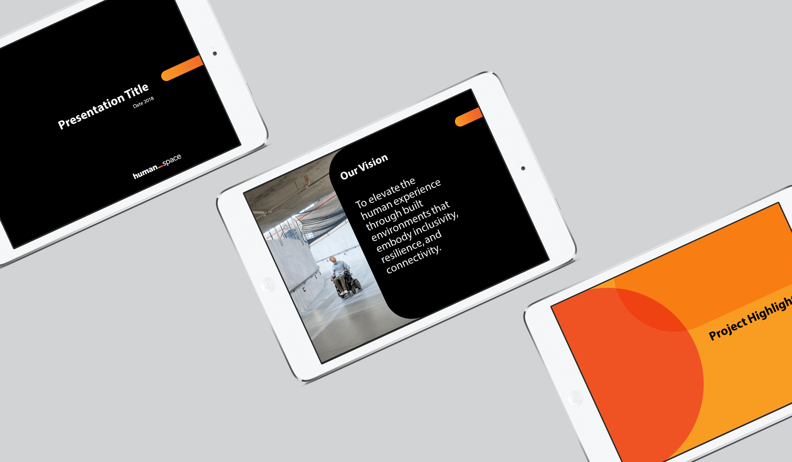
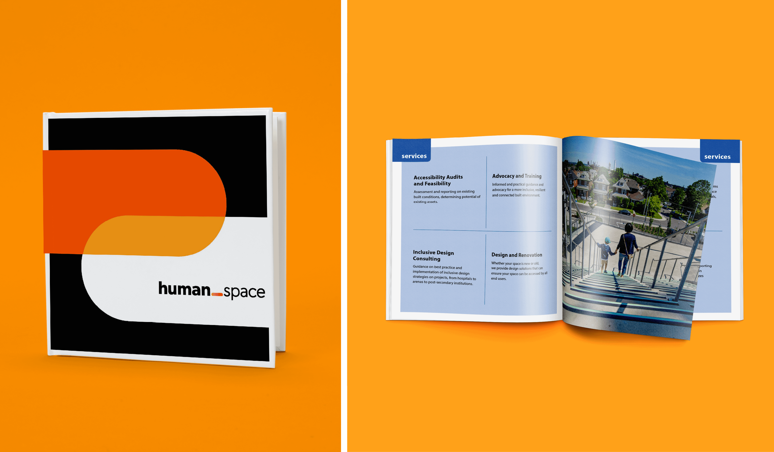
We chose variant complementary colours to match the boldness of the dominant orange.
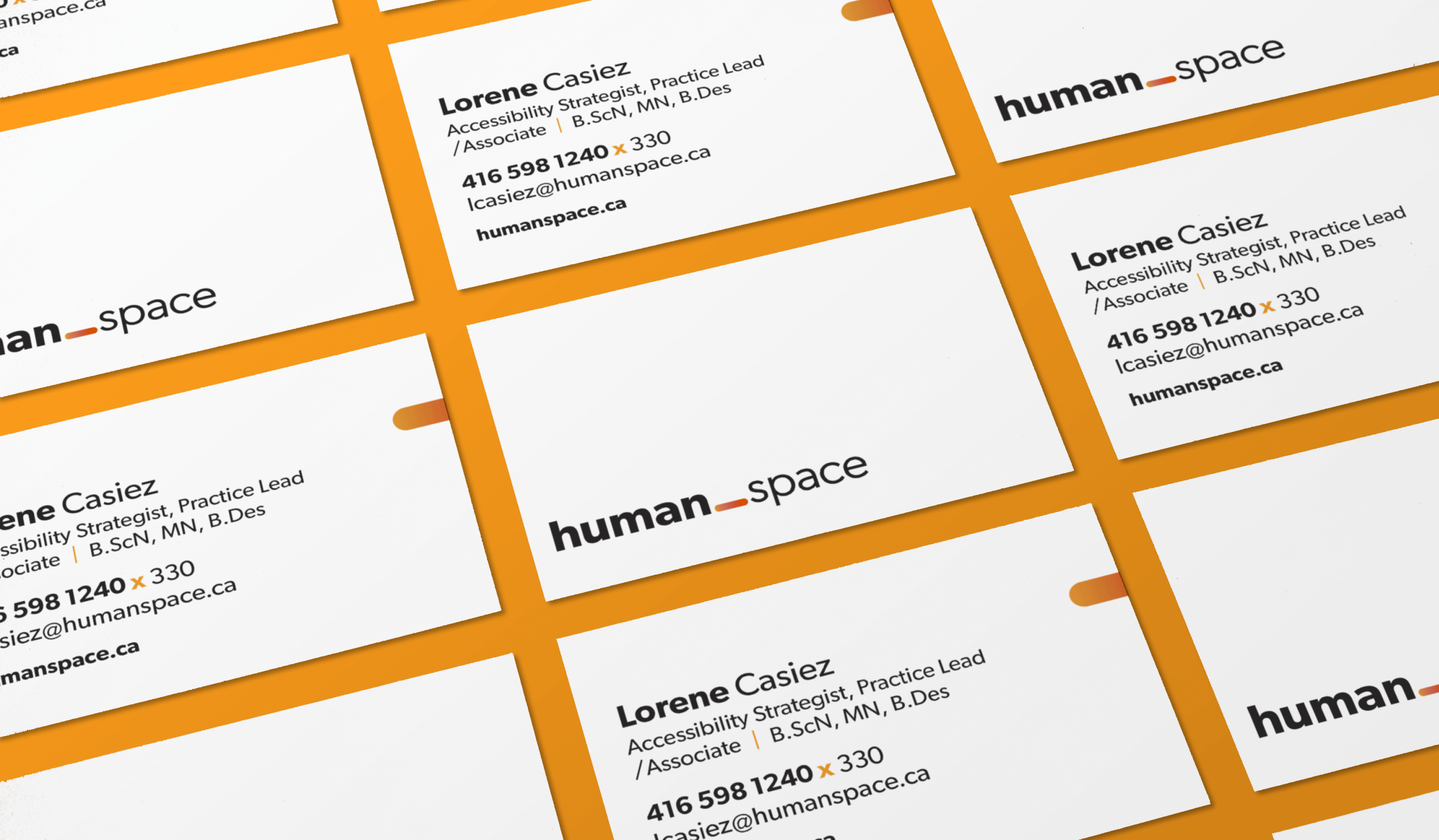
For business applications, the brand was pared down to its sparsest elements to convey the professionalism expected of a design consultancy.
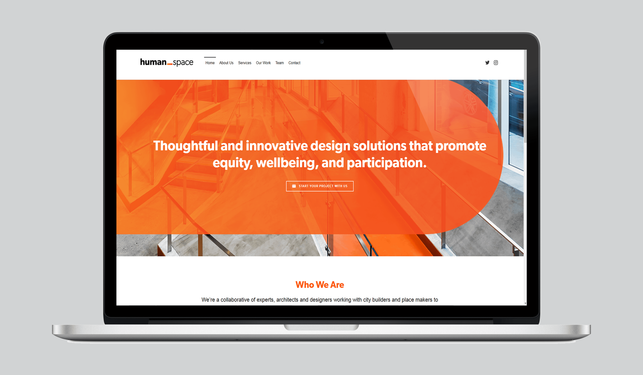
Our website brought all of these elements together to express the brand to its fullest.
Places for all
Equipped with a confident and assured brand vision, Human Space is ready to provide thoughtful and innovative design solutions that promote equity, wellbeing, and participation. We’re excited to get started.
Want to learn more? Click here to contact Human Space.